Client
Mondriaan Fonds
Services
Visit website
Advancing culture
The Mondriaan Fund is an organization that supports and promotes visual arts and cultural heritage in the Netherlands. They provide grants and invest approximately €30 million every year on behalf of the Ministry of Education, Culture, and Science. The fund supports hundreds of activities, projects, and programs initiated by nearly 1,000 applicants, processing more than 2,500 applications each year. Their goal is to ensure a robust and representative future for the Dutch visual arts and cultural heritage sector. Recently, the fund appointed a new acting director who has set a new course for the organization to become more open, diverse, and accessible to all target audiences.
You're welcome
Visual arts and cultural heritage are valuable tools for reflection on the past and present, as well as for gaining new insights into the future. The Mondriaan Fund believes that everyone should have access to these resources. By promoting the development, connection, and presentation of visual arts and cultural heritage, they strive to make them accessible to as many people as possible.
Many artists and cultural institutions have applied for grants from the fund, but not everyone. The complex rules, various options, legal requirements, and technical jargon all make the grant application process challenging, especially for young, inexperienced artists new to the industry. Additionally, research has shown that the fund’s brand image did not match its intended brand positioning. While the fund had high brand awareness, it was only within a specific segment of the population. Therefore, significant changes were necessary to reposition the brand. In close collaboration with the Mondriaan Fund team, we developed a brand positioning, communication strategy, and corresponding brand identity.
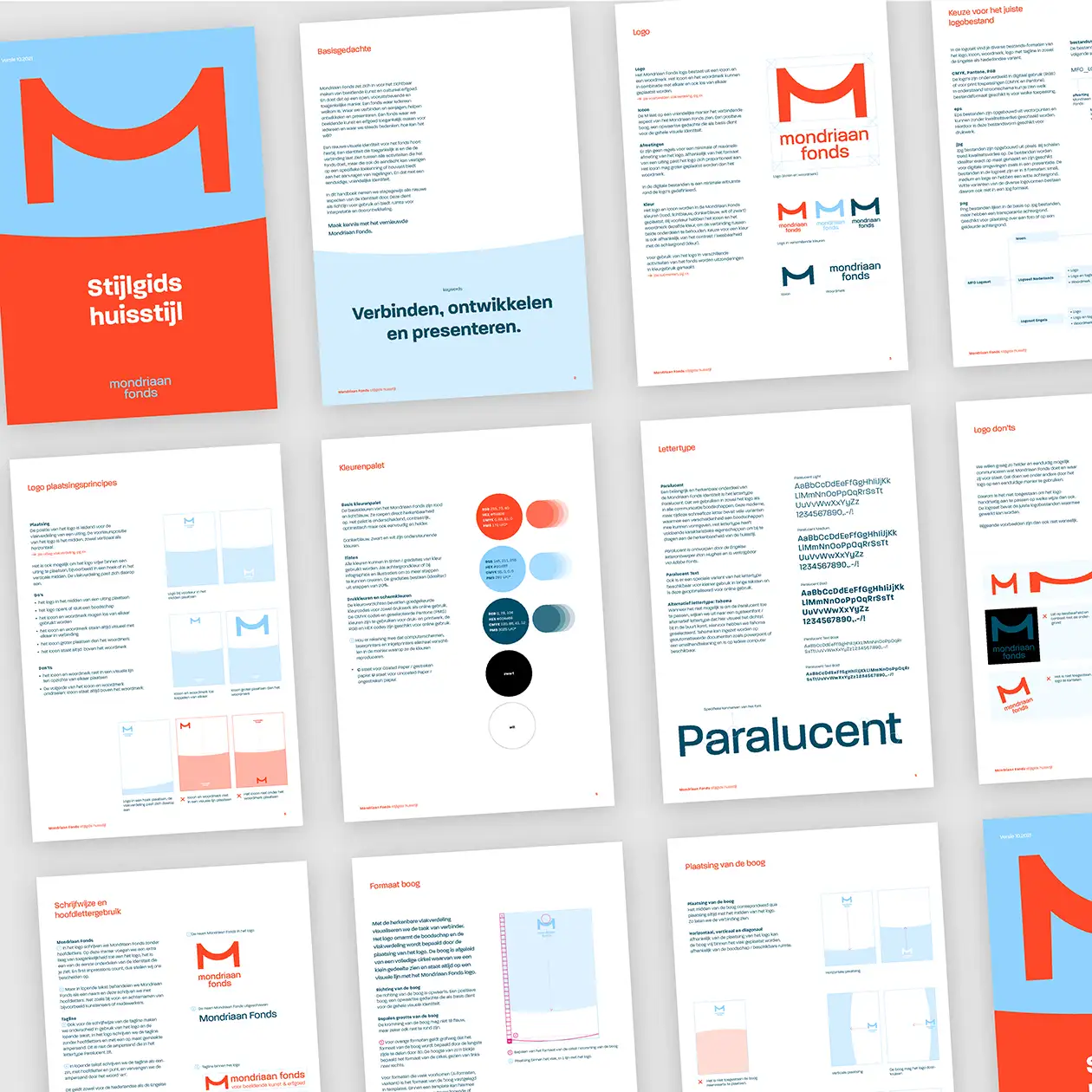
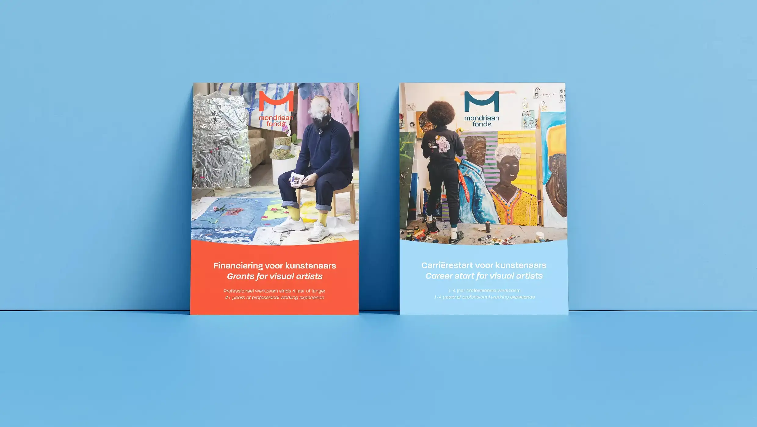
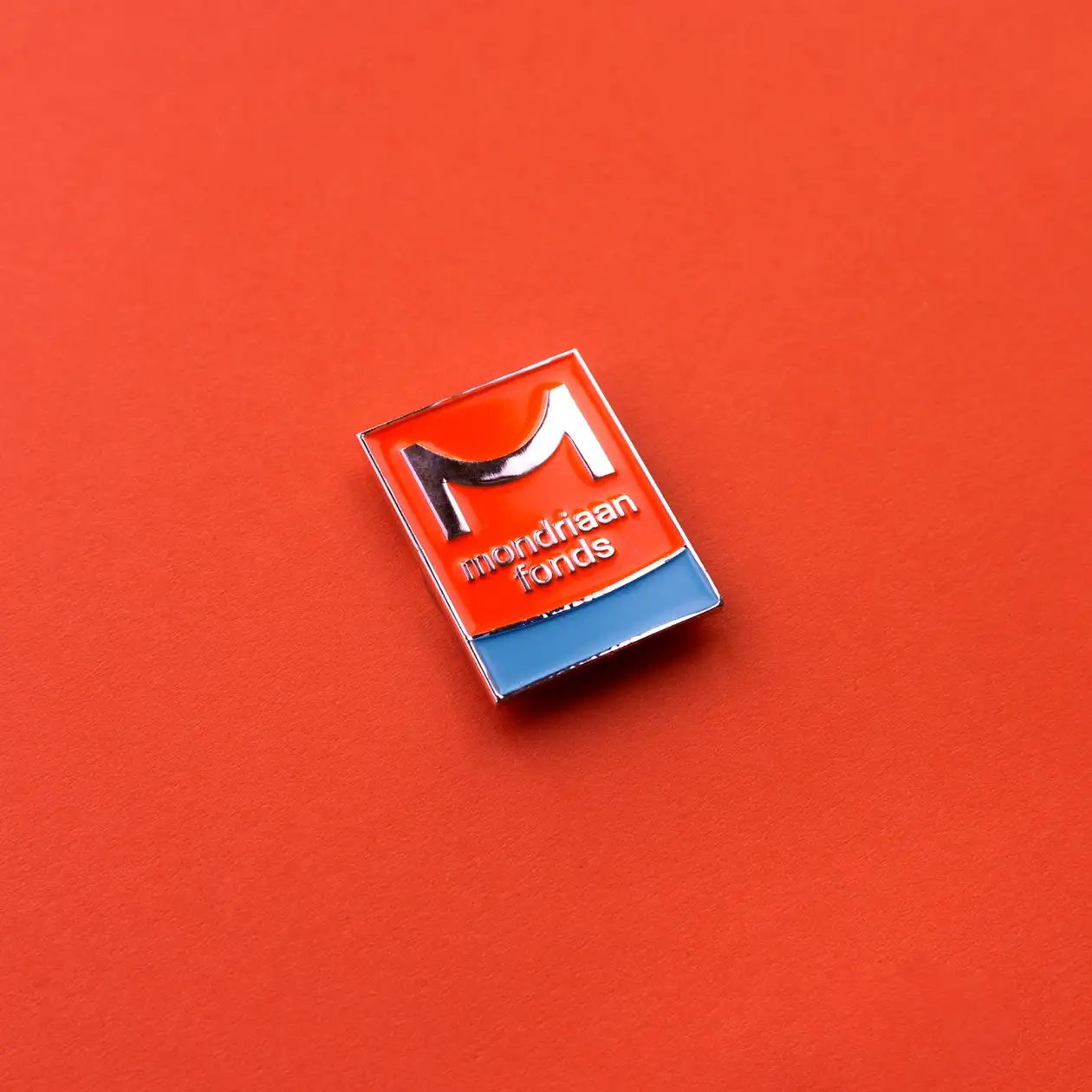
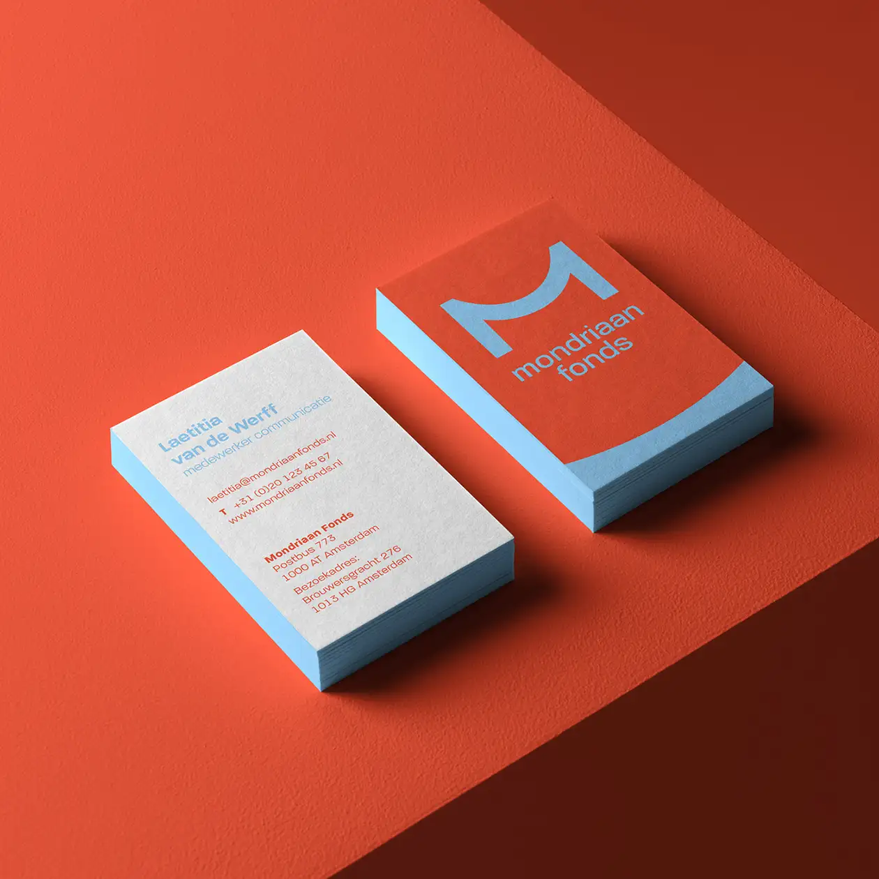
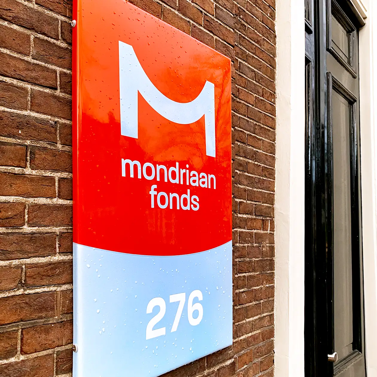
M is for Open
We have created a visual identity that aims to provide a welcoming feeling. While keeping the original M as a brand asset, we have redesigned its shape to make it more distinctive. The new shape of the M represents the connection and the bridge that Mondriaan Fund aims to establish in the visual arts and cultural heritage field. To add a more personal touch to the fund, we have used a friendly typeface, warm red color, and rounded edges. The use of light blue and bright white in the visual language adds contrast and brings freshness to the overall look.
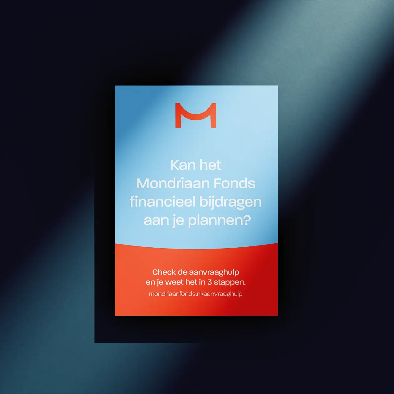
M is for accessible
We collaborated with our friends at @PMS72 to revamp the website. We conducted qualitative research among both experienced and inexperienced users, which helped us to enhance the platform’s user experience. We focused on revamping the application process for artists and organizations from scratch. The result is a more seamless and polished experience that improves the accessibility of our content.