LESS IS MORE
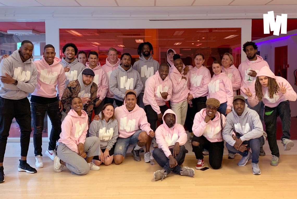
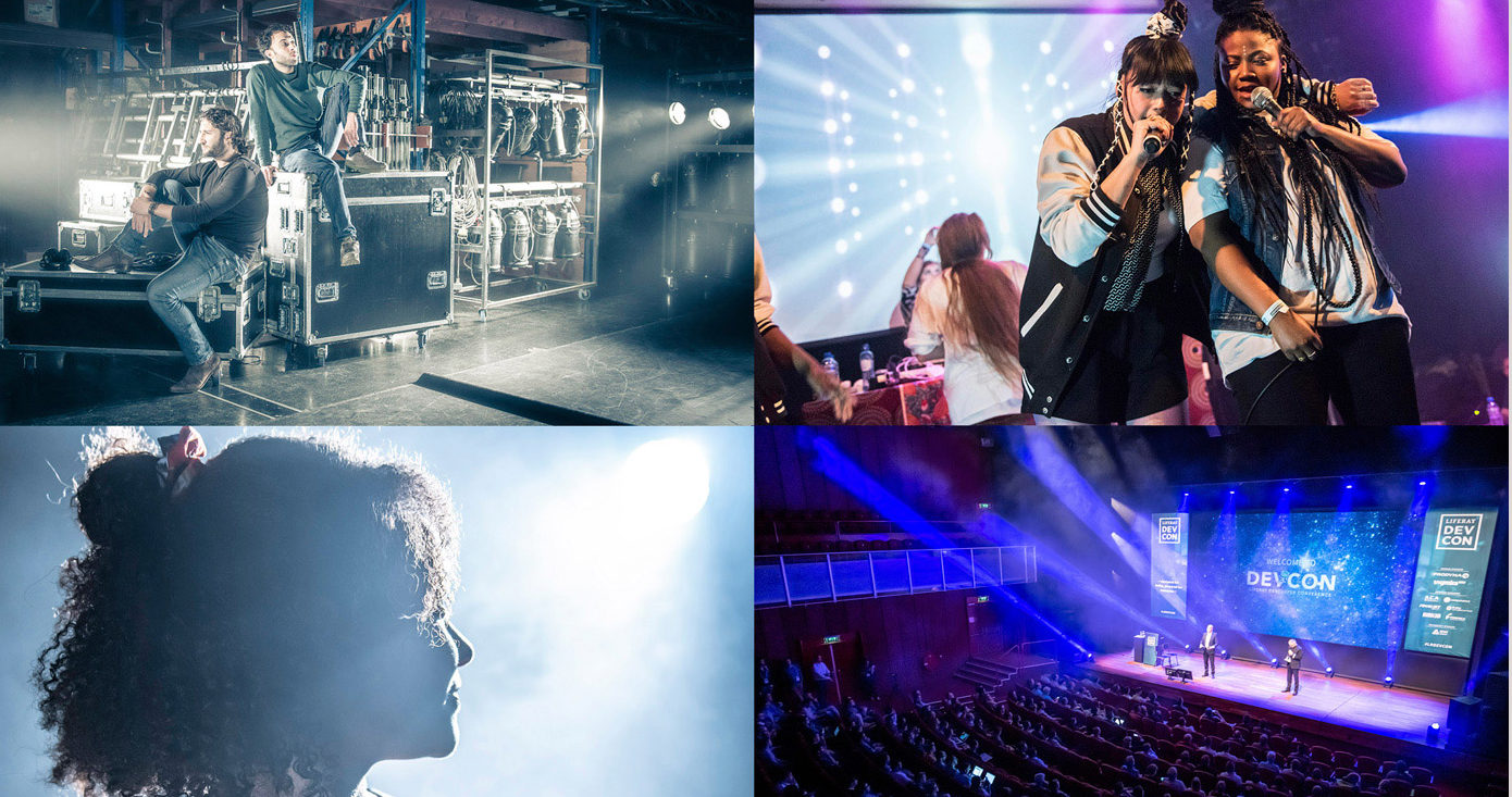
The Meervaart is a local theater located in Amsterdam-West. It is a place where people from diverse cultural backgrounds gather to share new stories. The theater is known for bringing together its audience, performers, and talent in one place and making them feel at home. Young people between the ages of 4 and 24 can explore their skills and find inspiration here. In addition, the Meervaart also provides an inspiring space for meetings and conferences. Therefore, the brand has decided to combine its four divisions – Theatre, Meetings & Events, Young, and Studio – under one brand identity.
- Client
- Meervaart
- Services
- Brand positioning, Brand architecture, Brand DNA, Visual & Verbal identity
- Visit website
- Meervaart.nl

Spot on
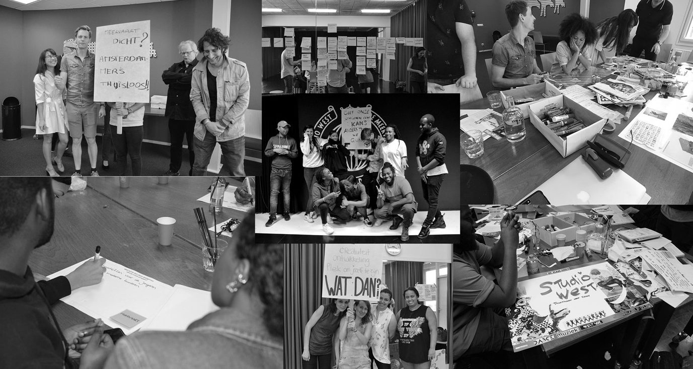
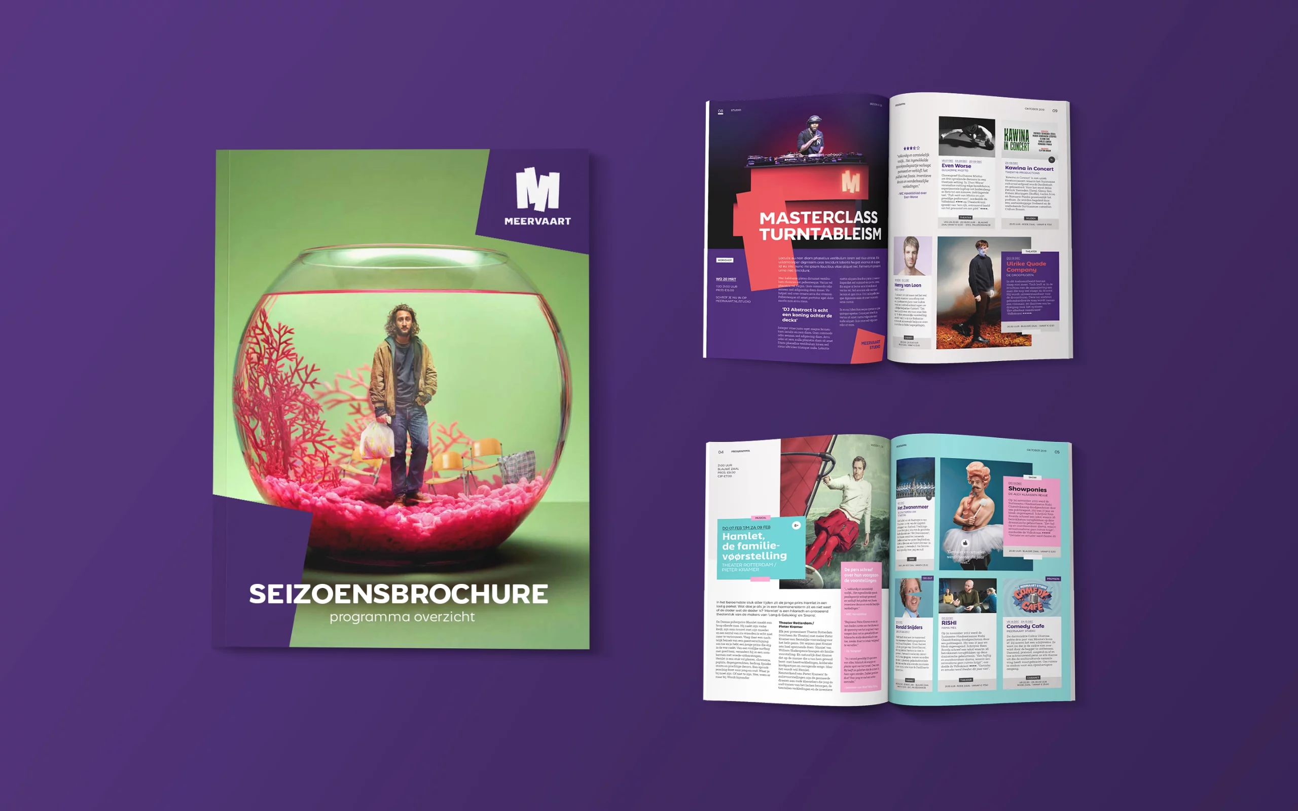
Meervaart had a diverse range of communication materials, and it was clear that they were operating too many brands for their marketing department to handle. We started with extensive research to find out what Meervaart was all about, and we discovered that it was an essential part of the community.
Everyone agreed that Meervaart was a place full of energy, where people could learn, laugh, and interact with each other. We then bundled that energy into the creative concept of Spotlight, to channel it into something special for everyone to enjoy.
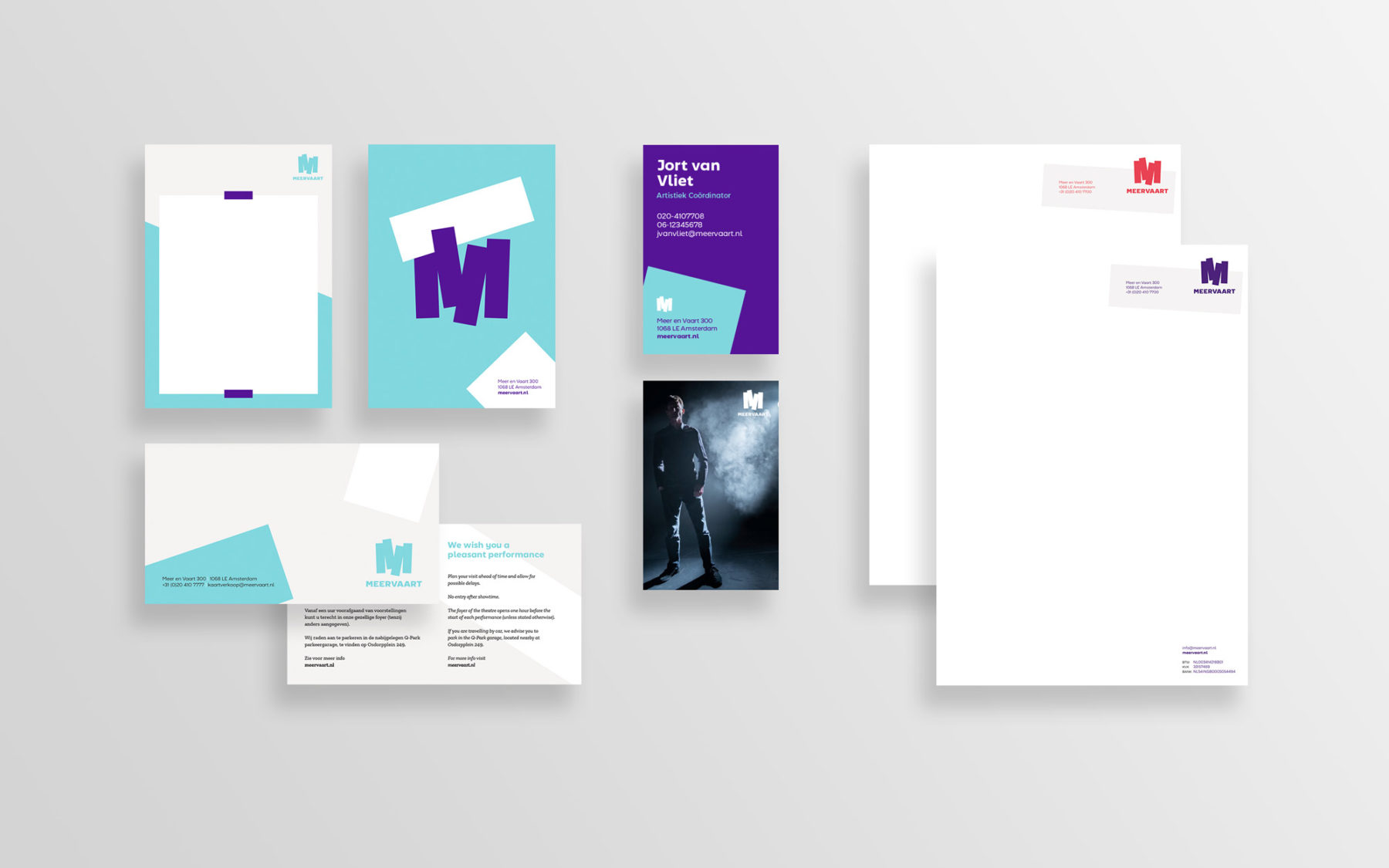
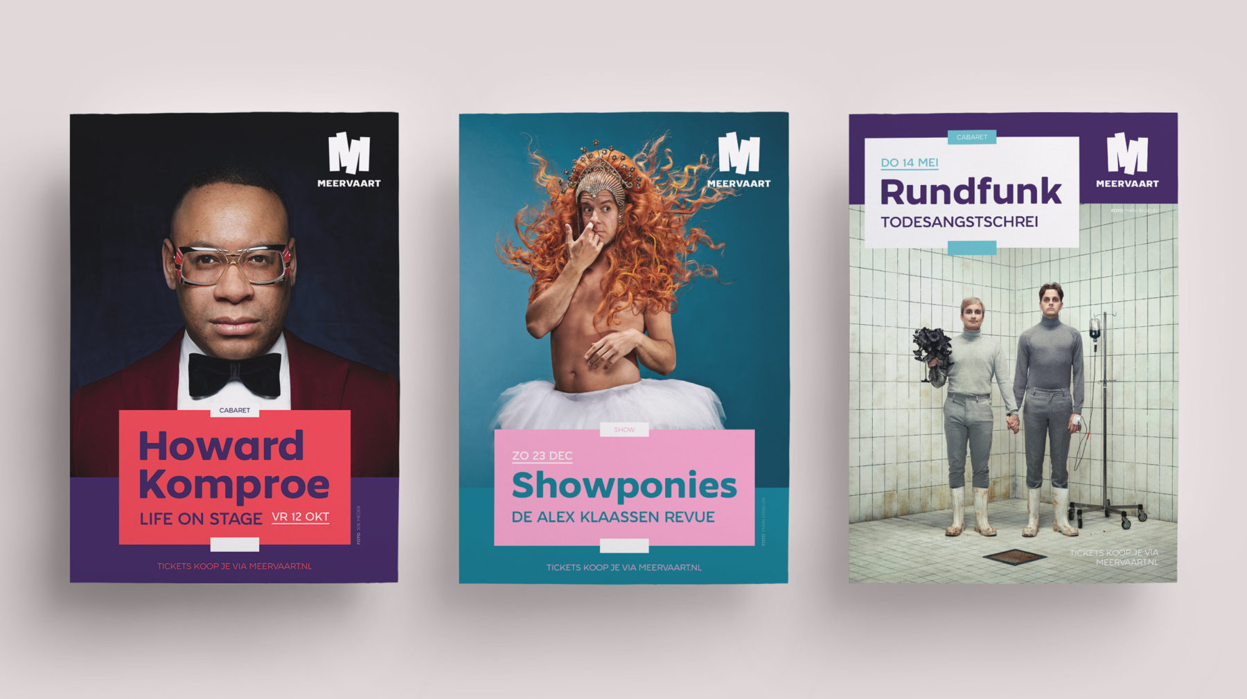
United but different
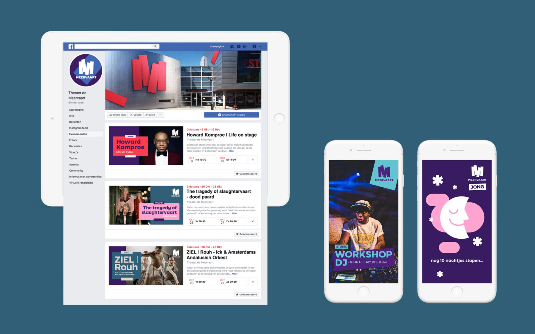
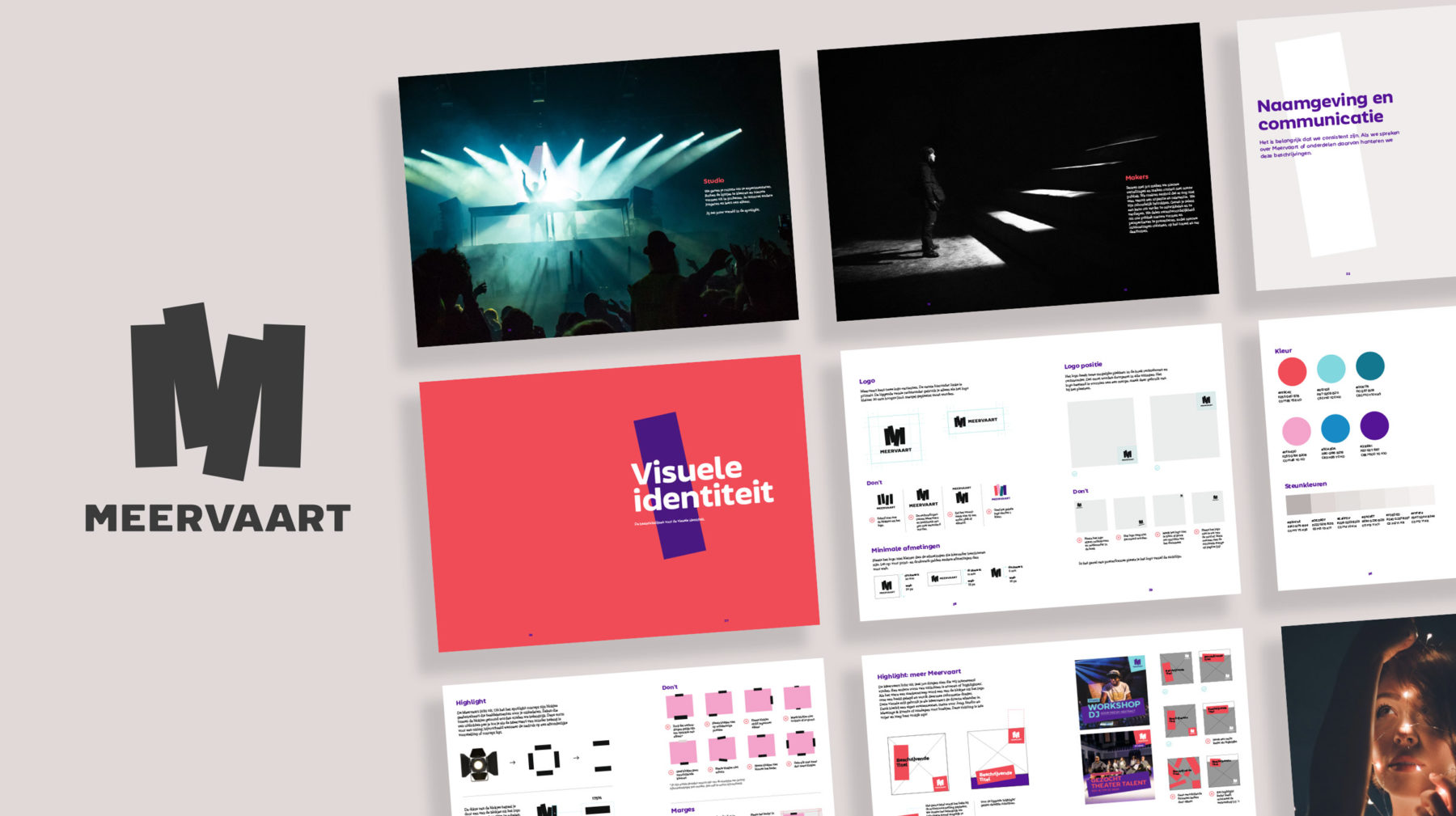
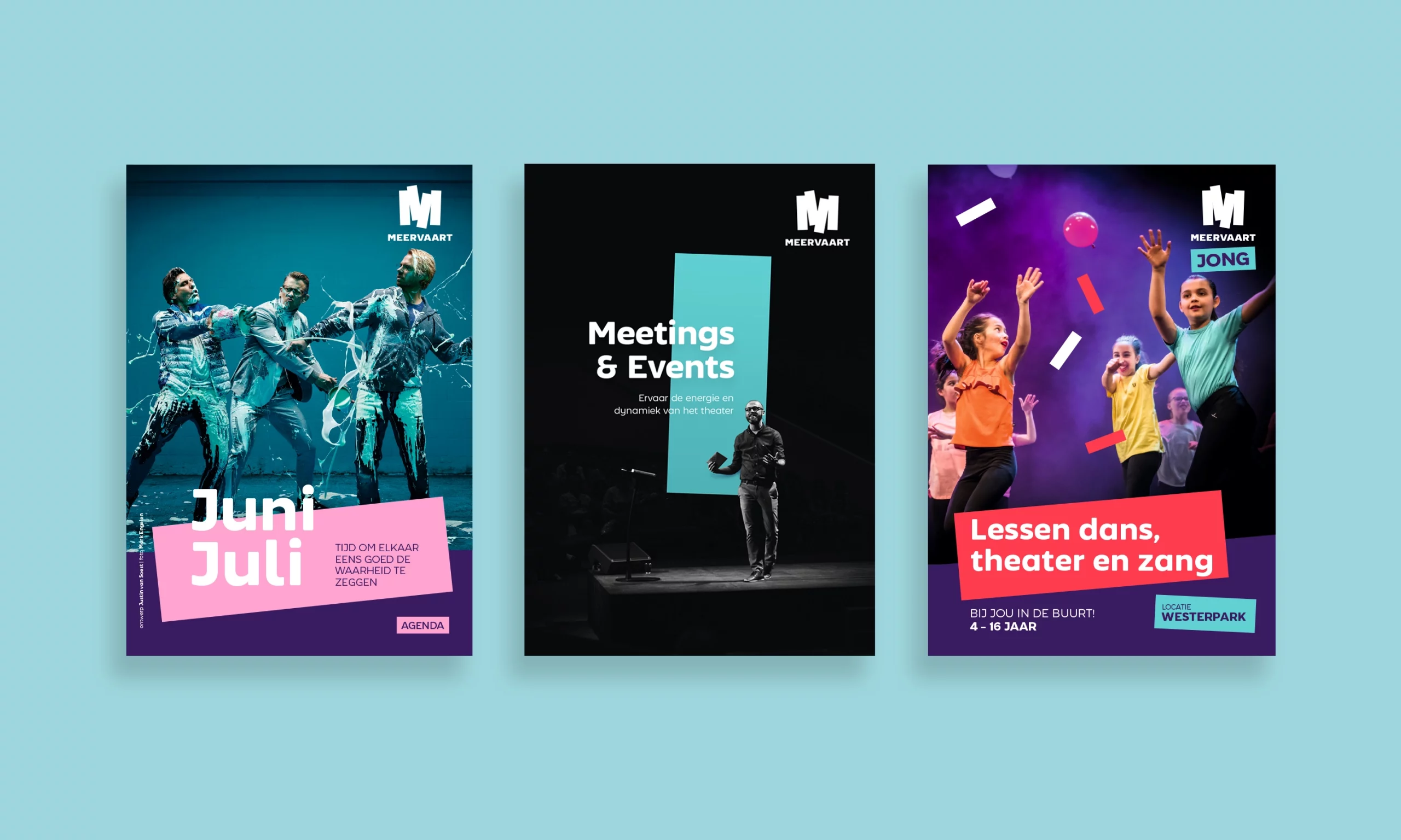
The overarching brand that brings together four different divisions is Meervaart. While each division has its own name, they share common brand assets. By rearranging the color schemes and other assets within the brand style, each division can differentiate itself and appeal to its specific target audience.
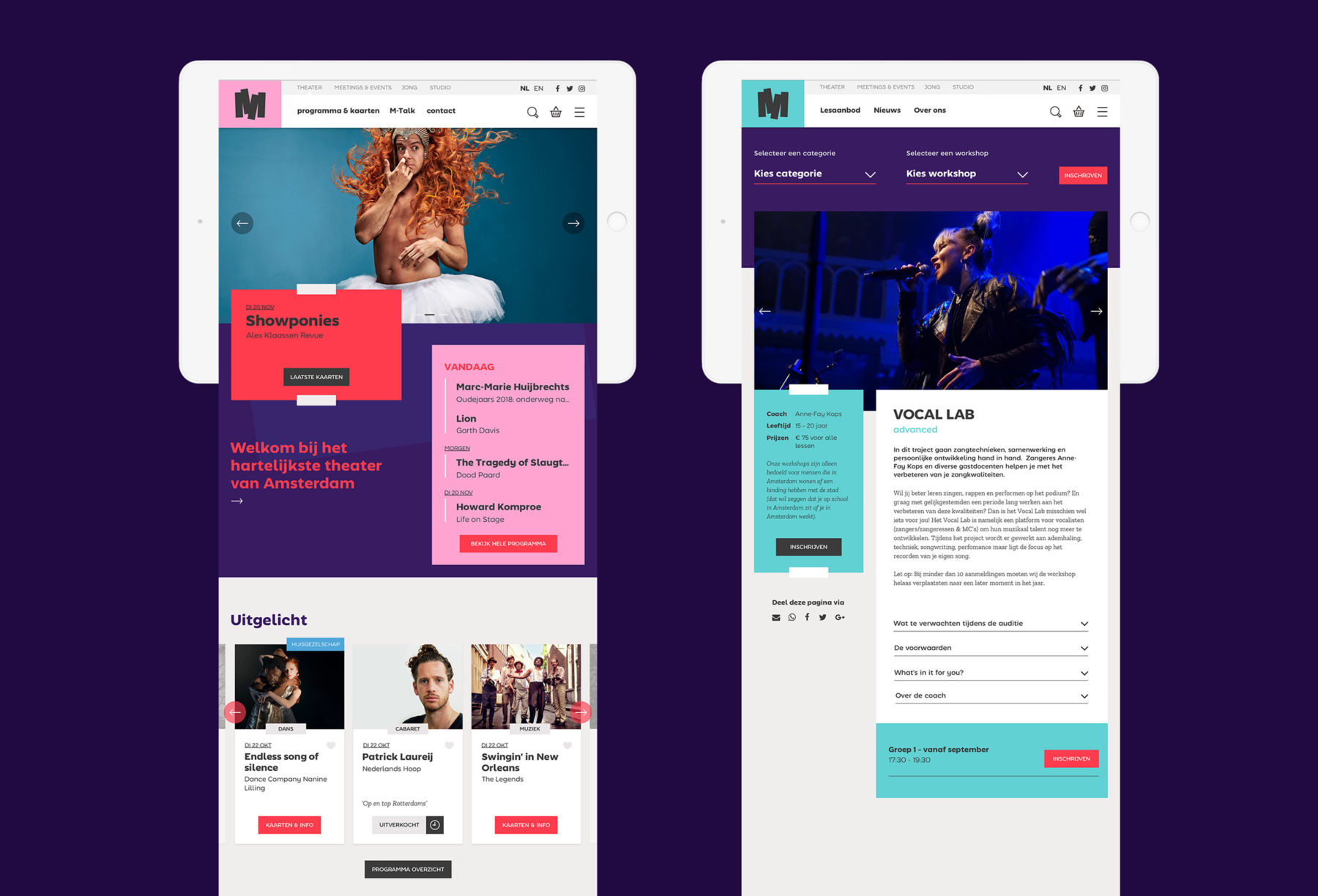
Online
The website played an instrumental role in their success, acting as a hub where all target segments converged. It is the one-stop-shop for purchasing tickets, booking conferences, signing up for workshops, and more. Recognizing its significance, the site underwent a thorough revamp and redesign, focusing on enhancing the user experience and making it more user-friendly. We paid close attention to the smallest details, resulting in a sleek, streamlined, and efficient platform that exceeded expectations.