Client
Stichting Je Goed Recht
Services
From Complexity to Clarity
How do you make legal aid approachable and recognizable while maintaining an image of expertise and reliability? For Je Goed Recht, a social enterprise in Rotterdam offering free legal assistance, this was a crucial question. They needed strong positioning and a visual identity that would resonate with both those seeking help and professionals referring clients to their services.
Empowering access to justice
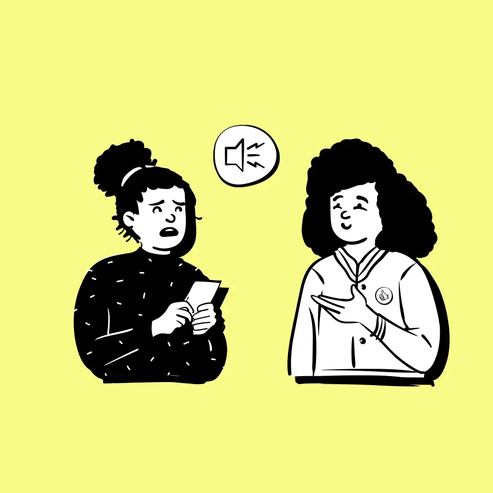
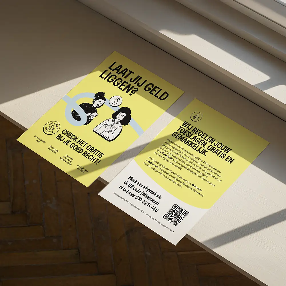
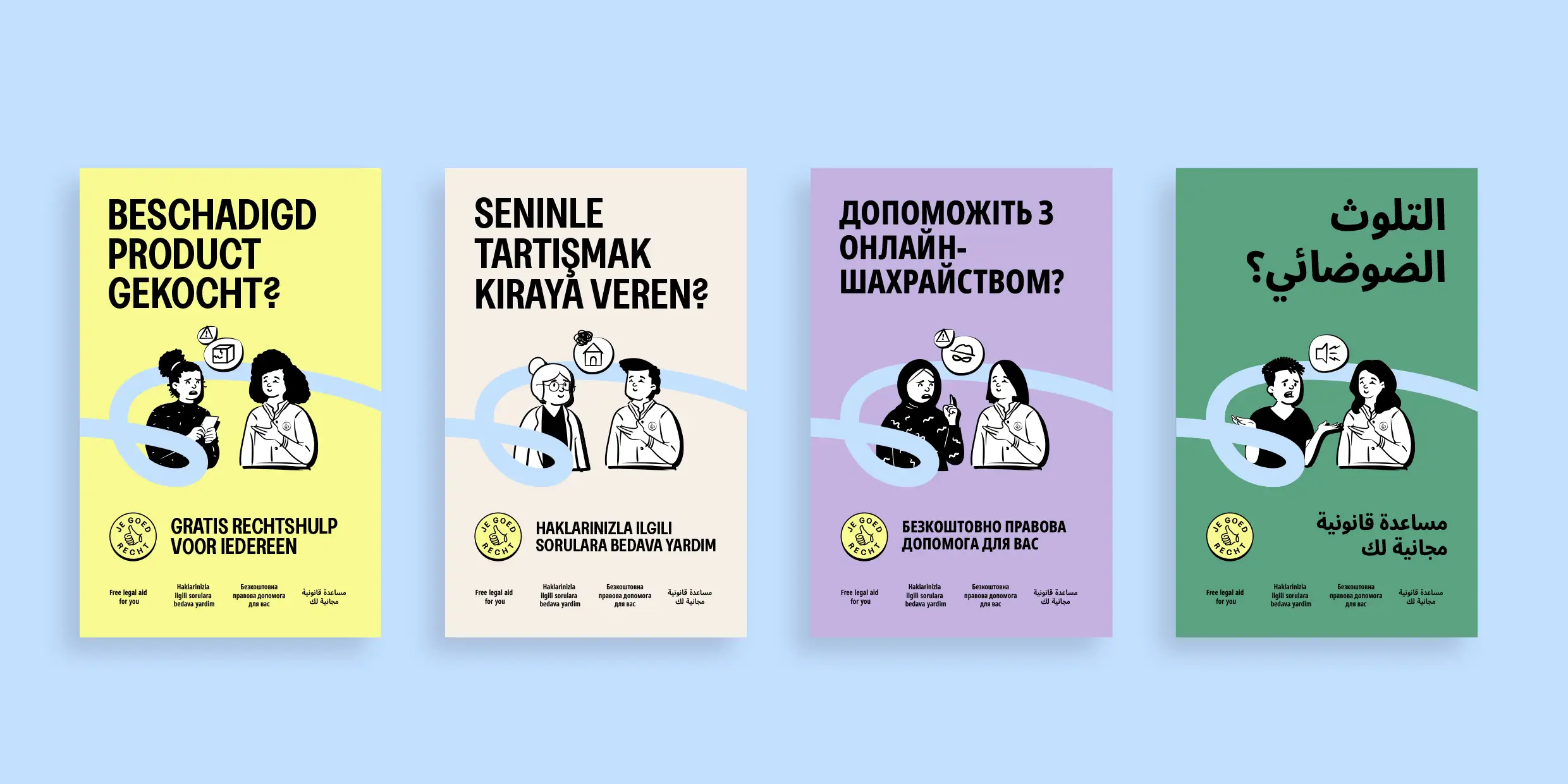
The strength of Je Goed Recht lies in simplicity, human connection, and accessibility. Based on these insights, we developed a positioning statement that clearly conveys their purpose: ‘Free legal aid for everyone, without barriers.’
Bold and Recognizable
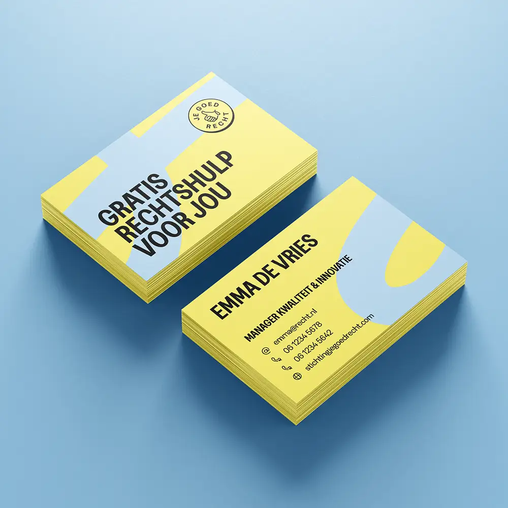
Visually, we chose a fresh and approachable design, with colors and shapes that communicate trust and professionalism. The typography is straightforward and clear, ensuring the message resonates with diverse audiences, from referrers to individuals seeking legal assistance.
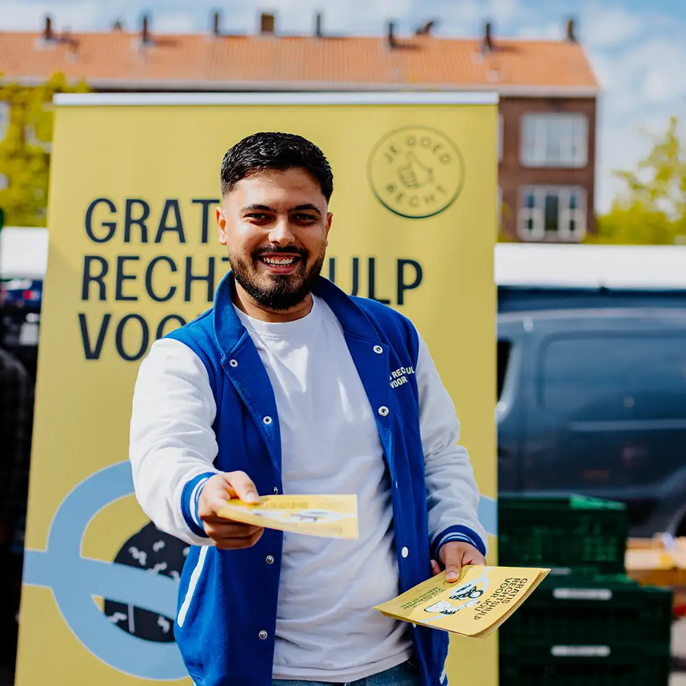

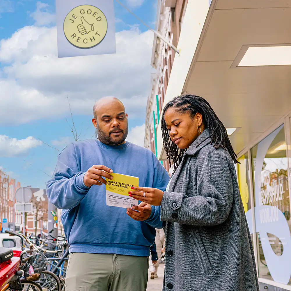
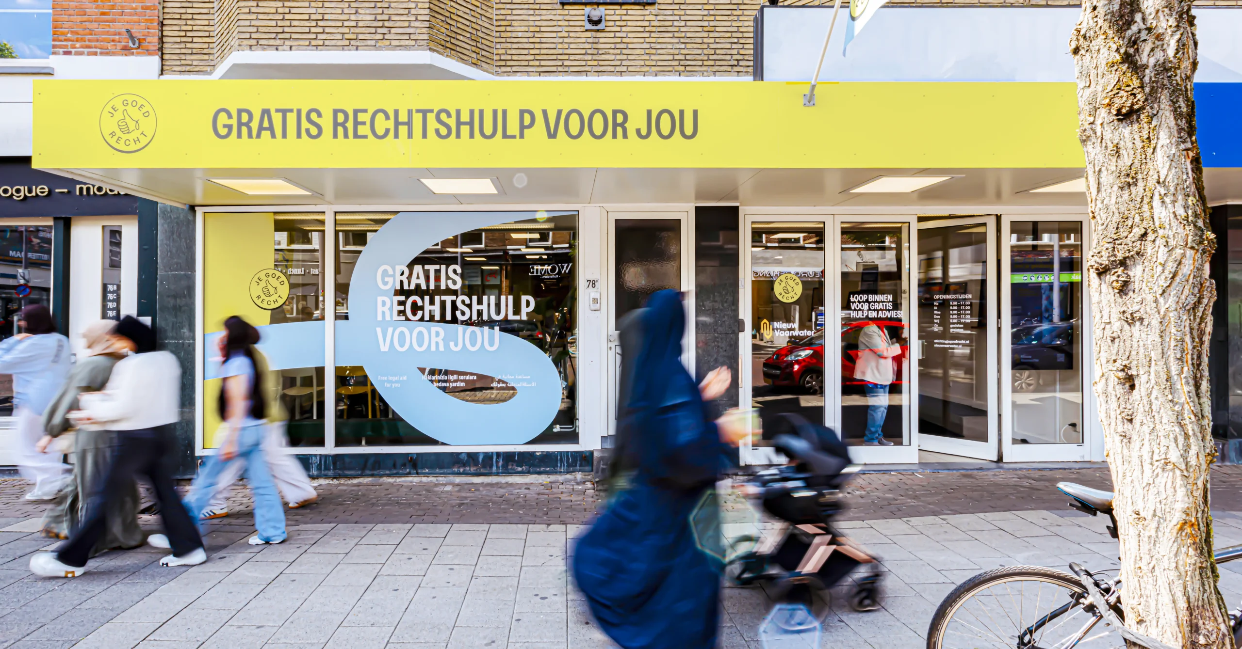
Reach people in need
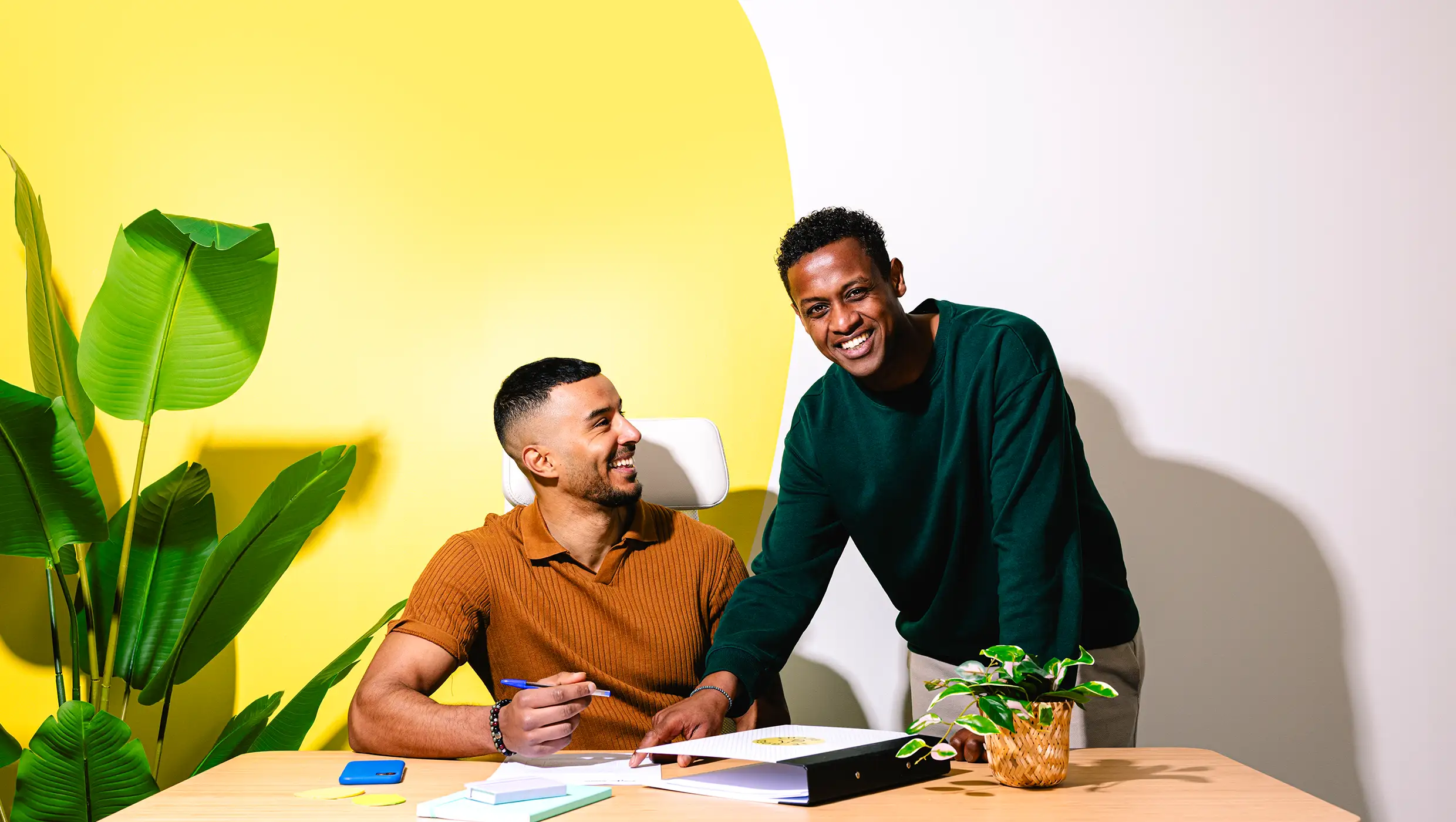
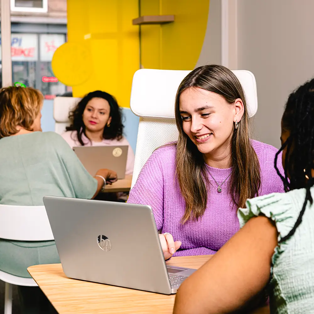
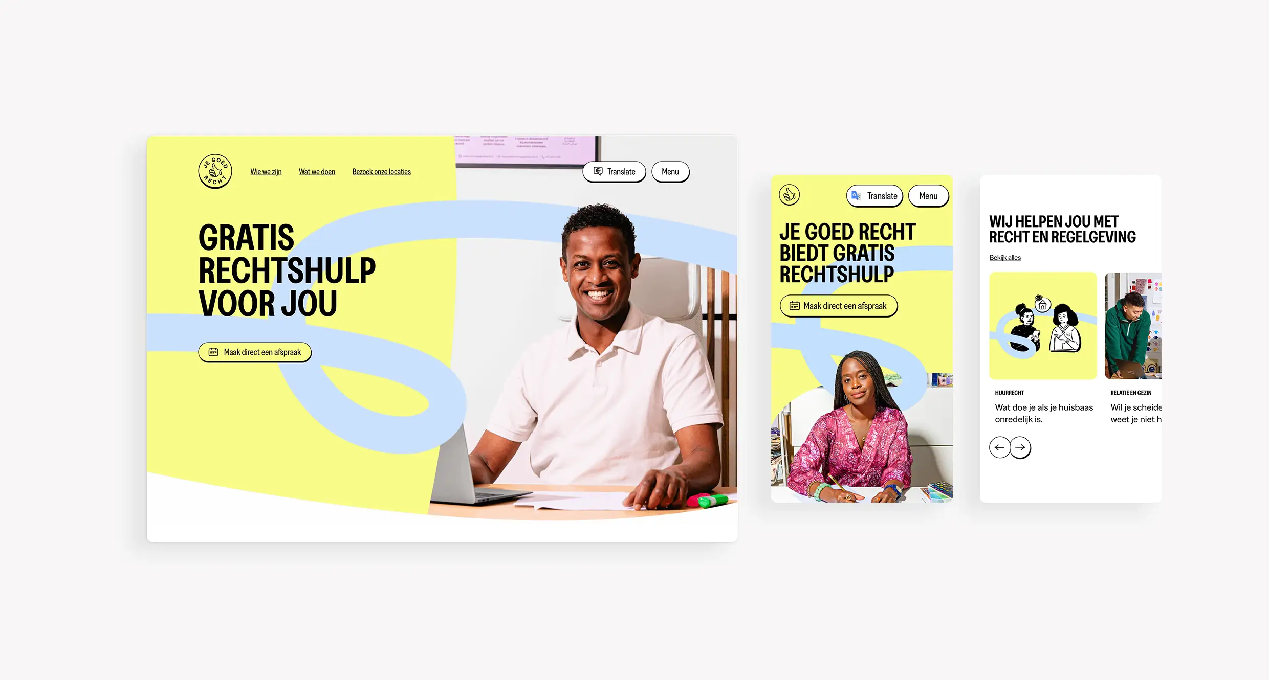
At Das Buro, we developed a comprehensive positioning and visual identity for Je Goed Recht. Central to our approach was clarity and accessibility. We designed a multilingual website with clear, concise text to ensure inclusivity and ease of use. The visual identity extended beyond digital platforms to their physical presence, including highly recognizable storefronts, impactful street signage, and cohesive visuals for social media.