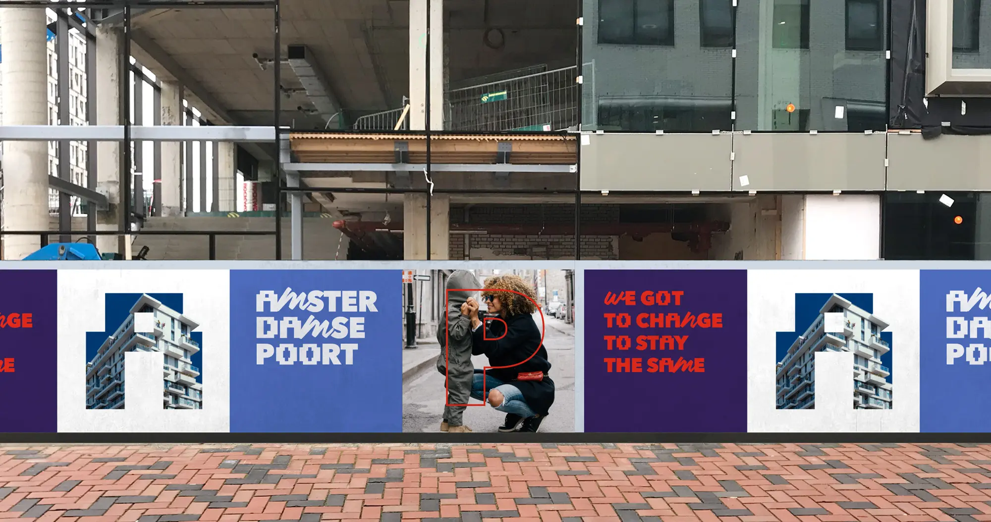
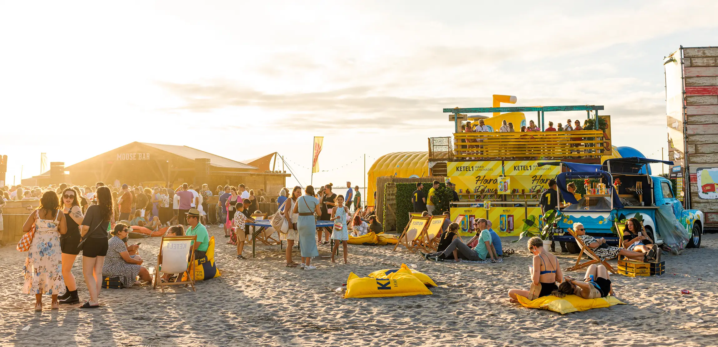
UNITY IN DIVERSITY
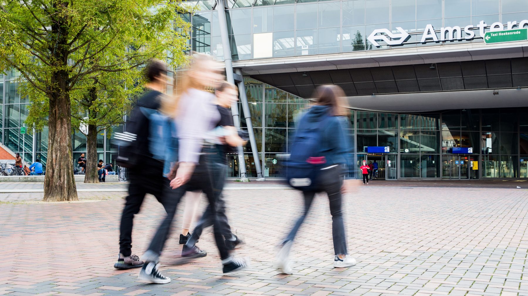
The Amsterdamse Poort is located next to the ArenaStation in Amsterdam South-east. It is commonly referred to as ‘het Poortje’, and is a popular meeting place for locals. This area has a rich history and is constantly evolving. To effectively communicate this transition, a clear visual identity is required. All parties and individuals involved should have the ability to adopt this style in their communication, allowing the entire area to communicate as a vibrant and proud community.
- Client
- CBRE, Brand Urban Agengy
- Services
- Visual identity, Brand collateral, Product campaigns
- Visit website
- amsterdamsepoort.nl
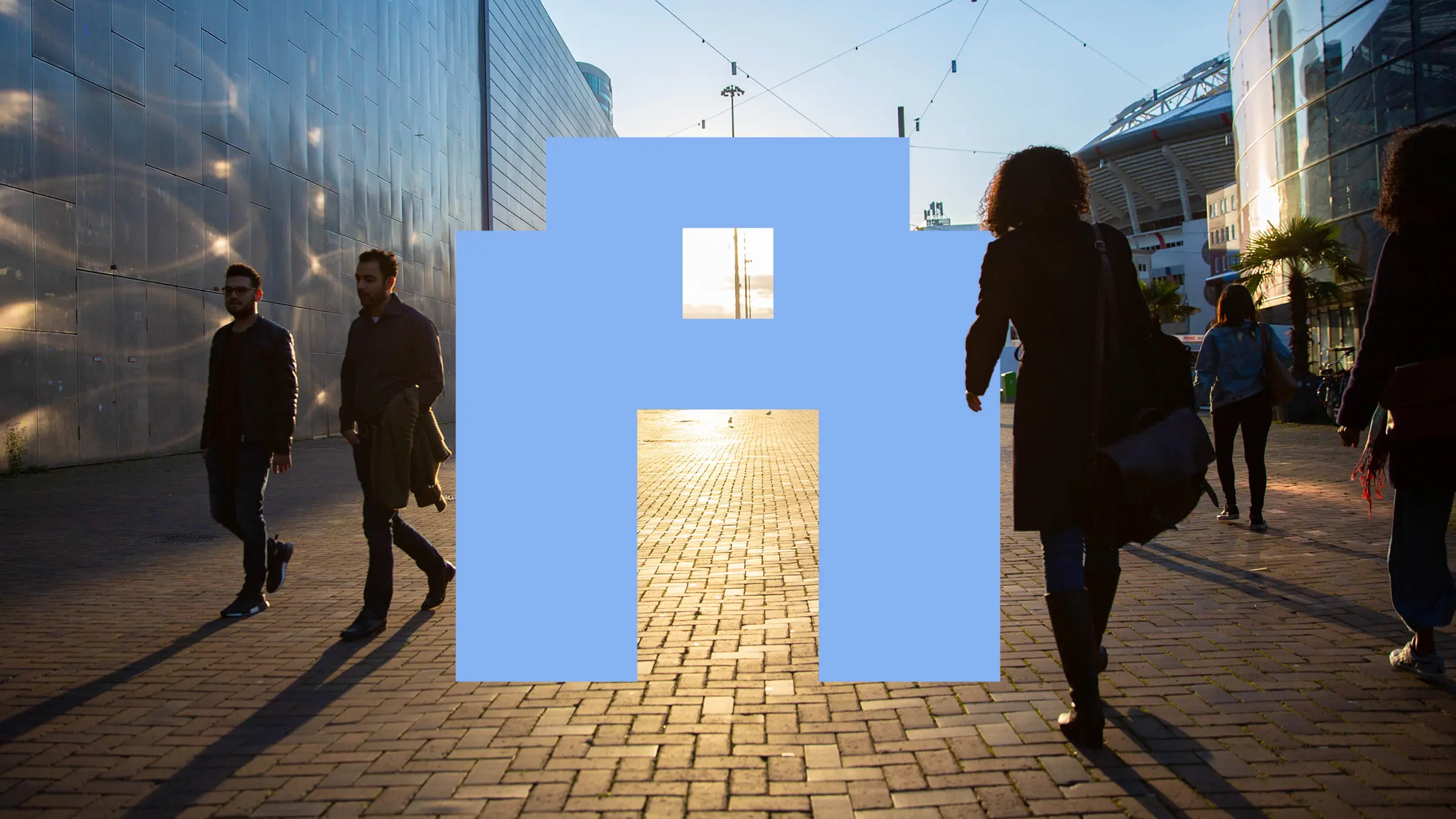
Distinct and adaptable
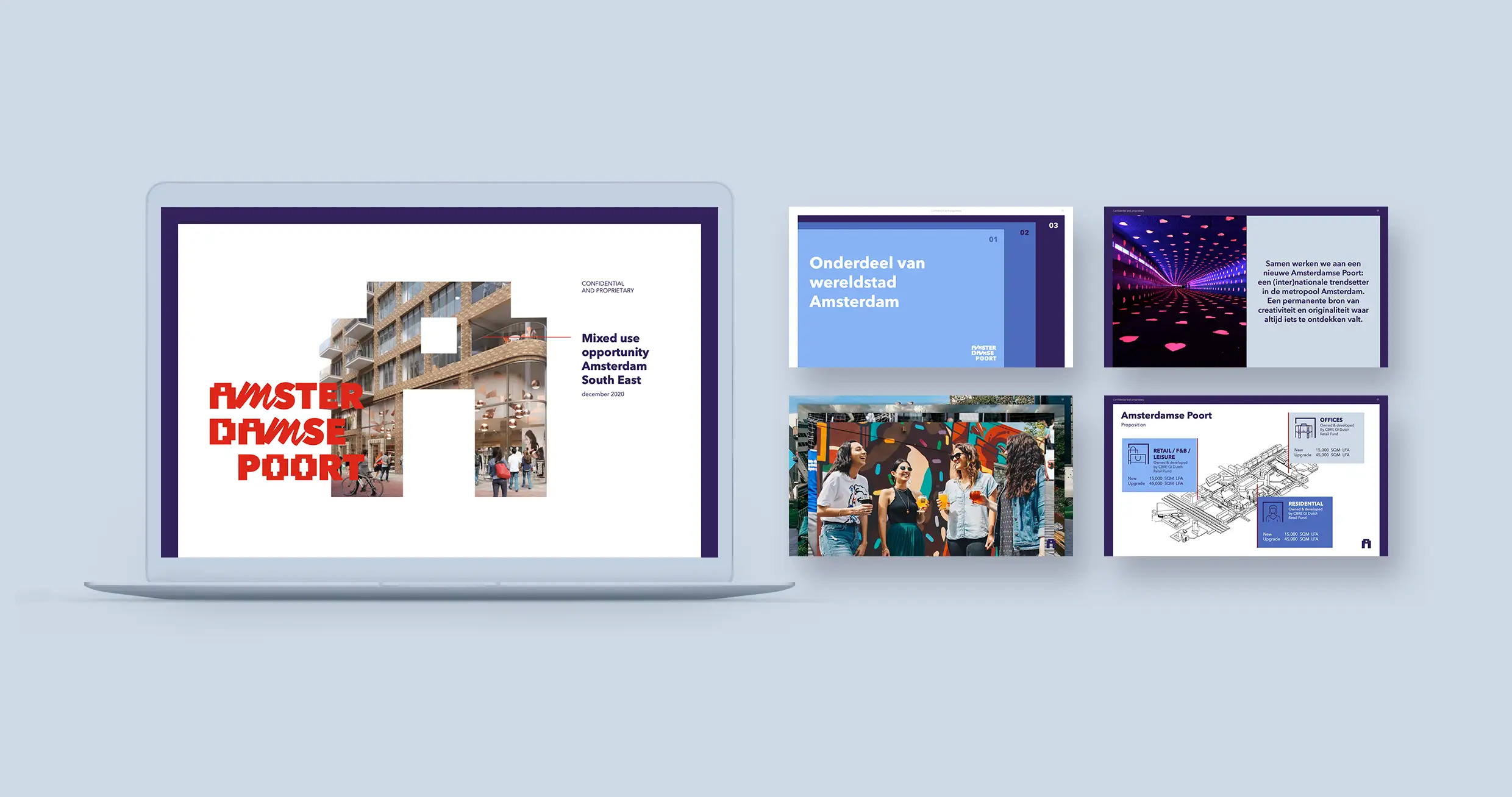
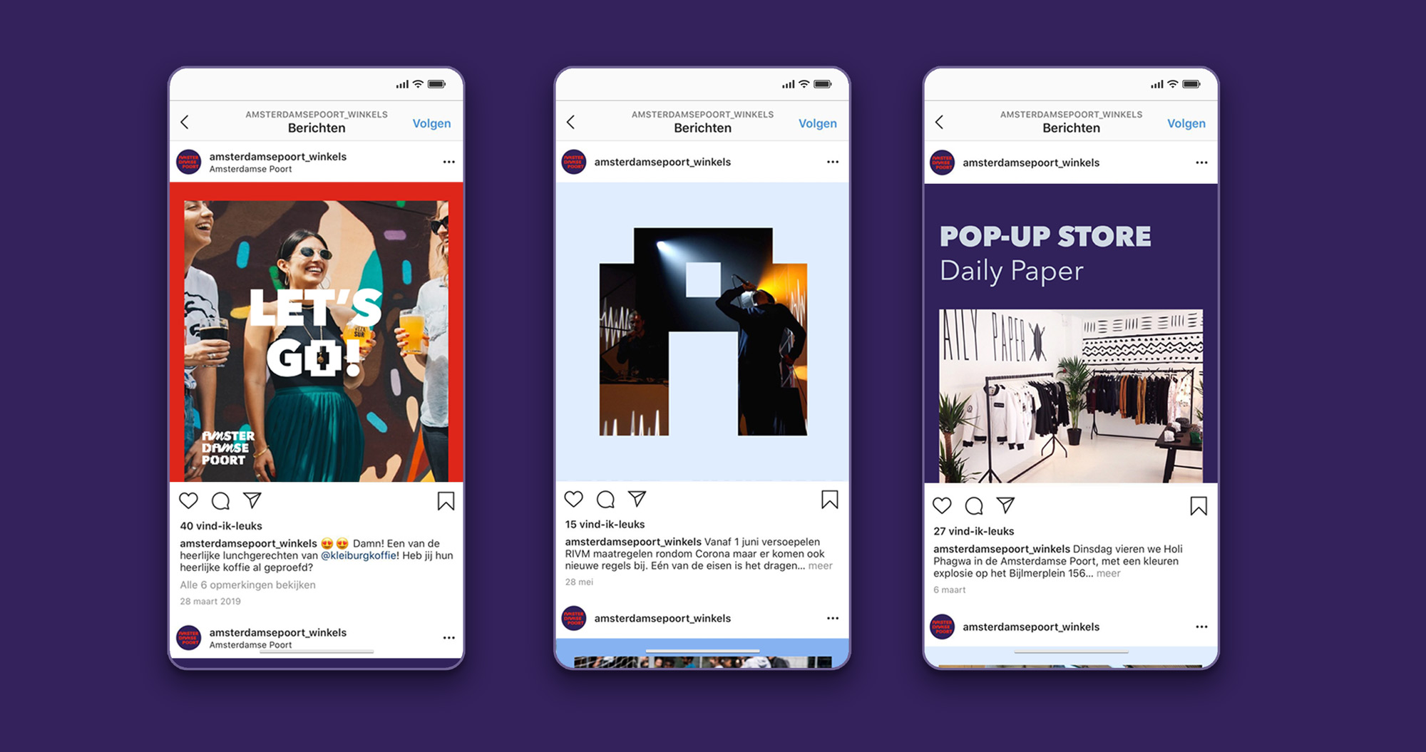
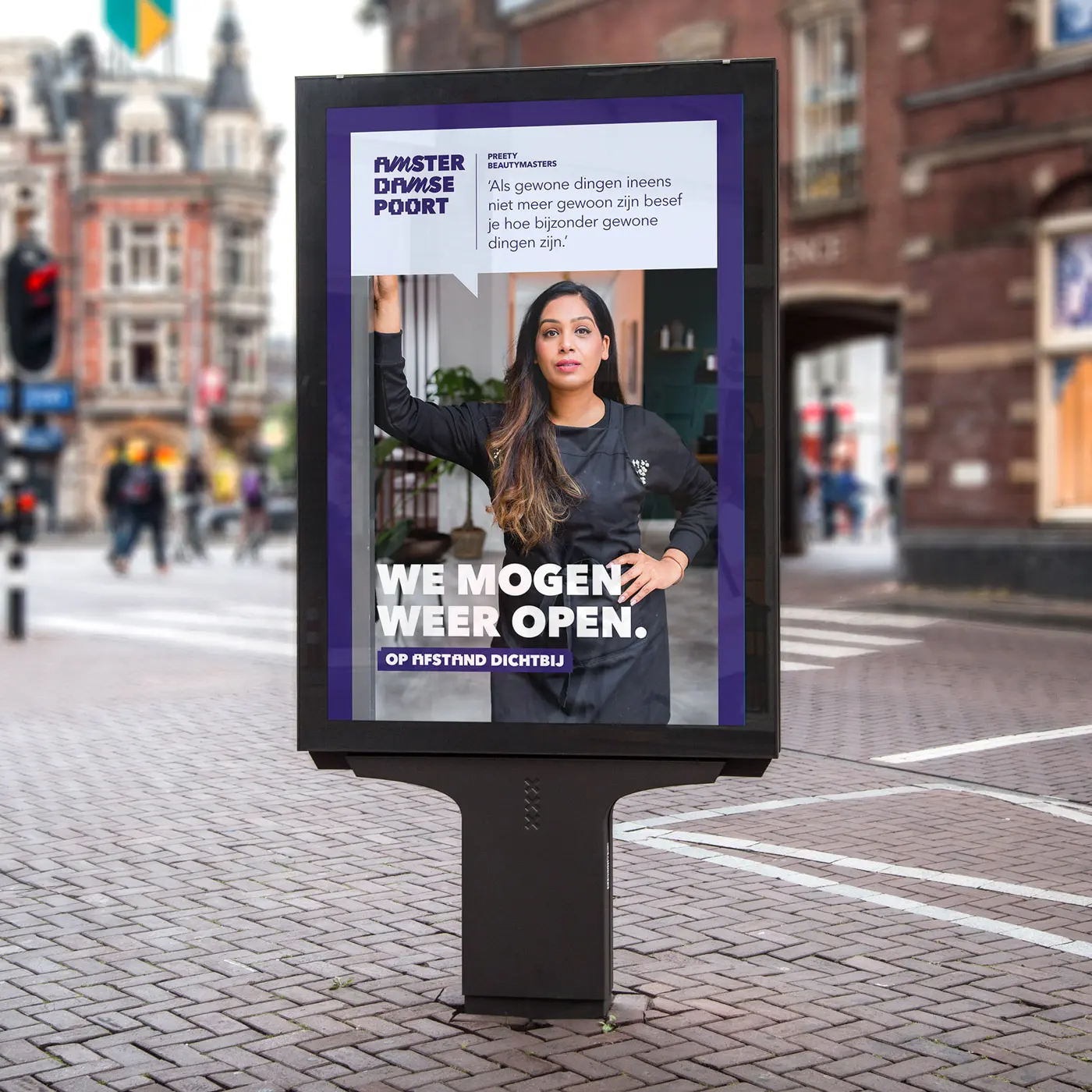
The visual identity is adaptable for companies operating in the area and individuals involved in community building. There is clear communication about projects and events in Amsterdamse Poort, and many initiatives in the area can adopt the style and make it their own. Experiments and social entrepreneurs are the building blocks of this neighborhood, so the visual identity provides space for everyone’s interpretation without losing its distinctiveness.
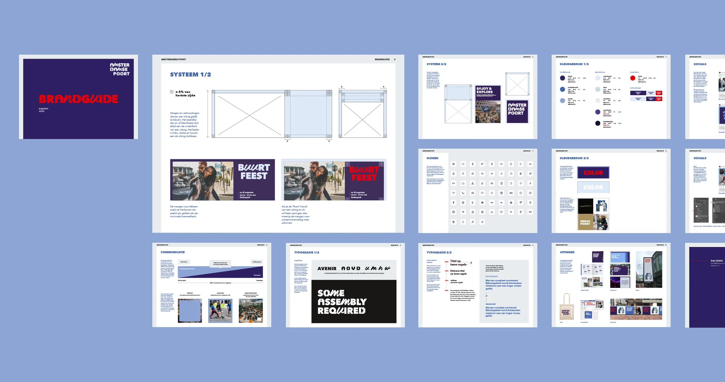
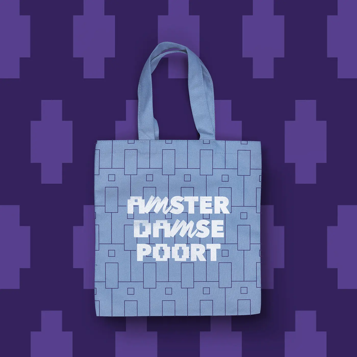
Brand identity
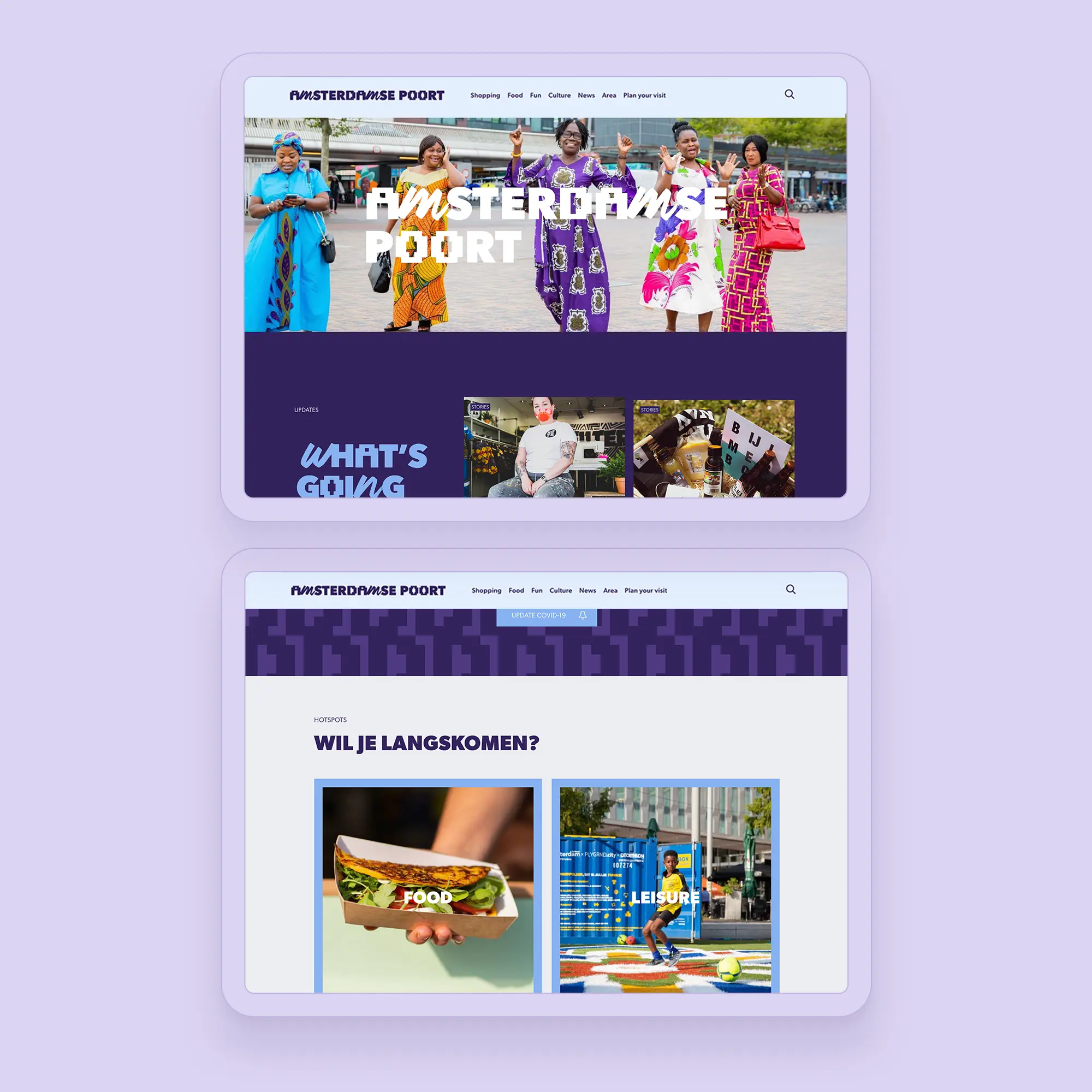
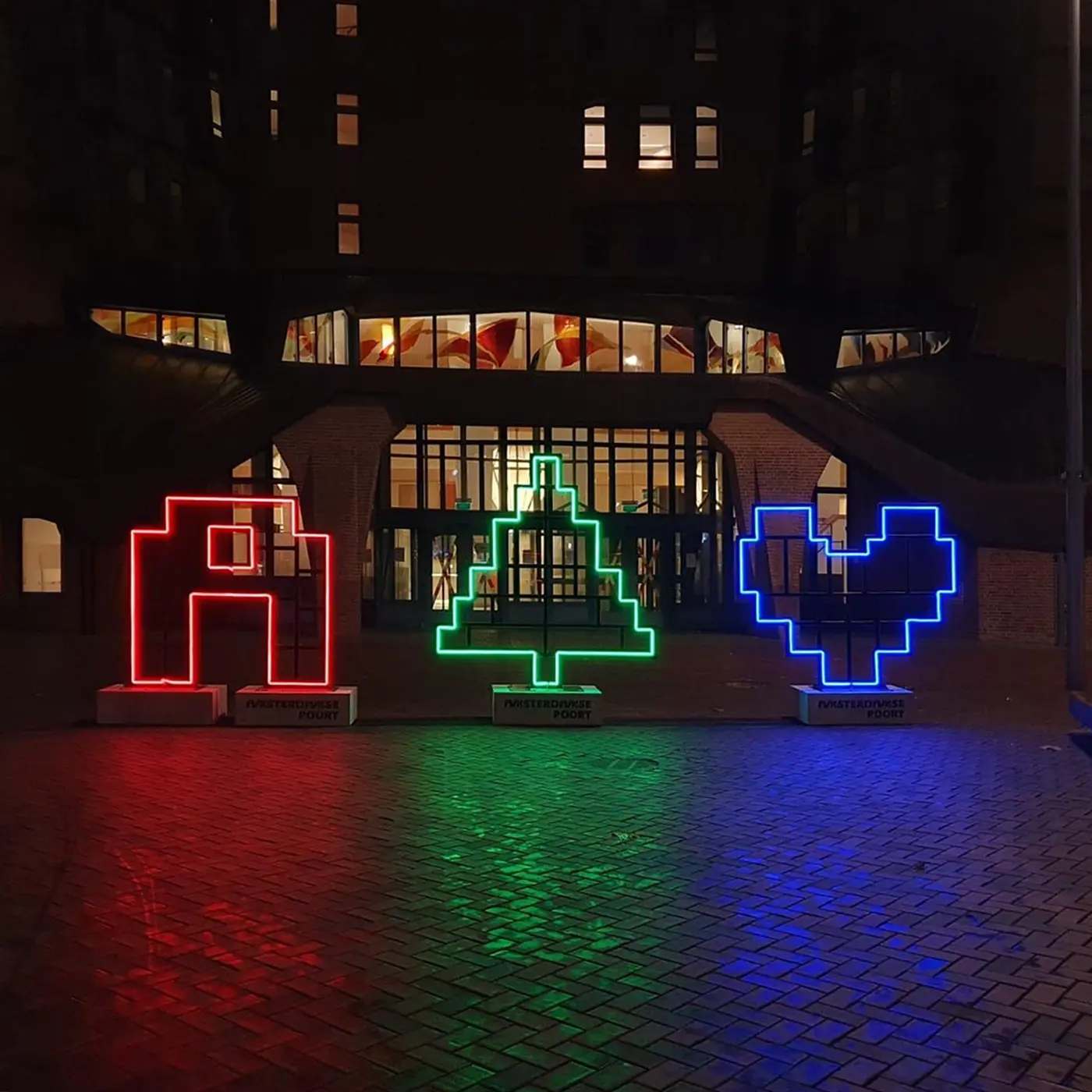
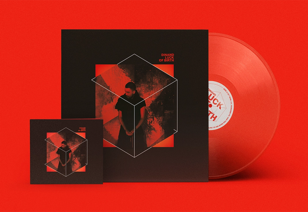
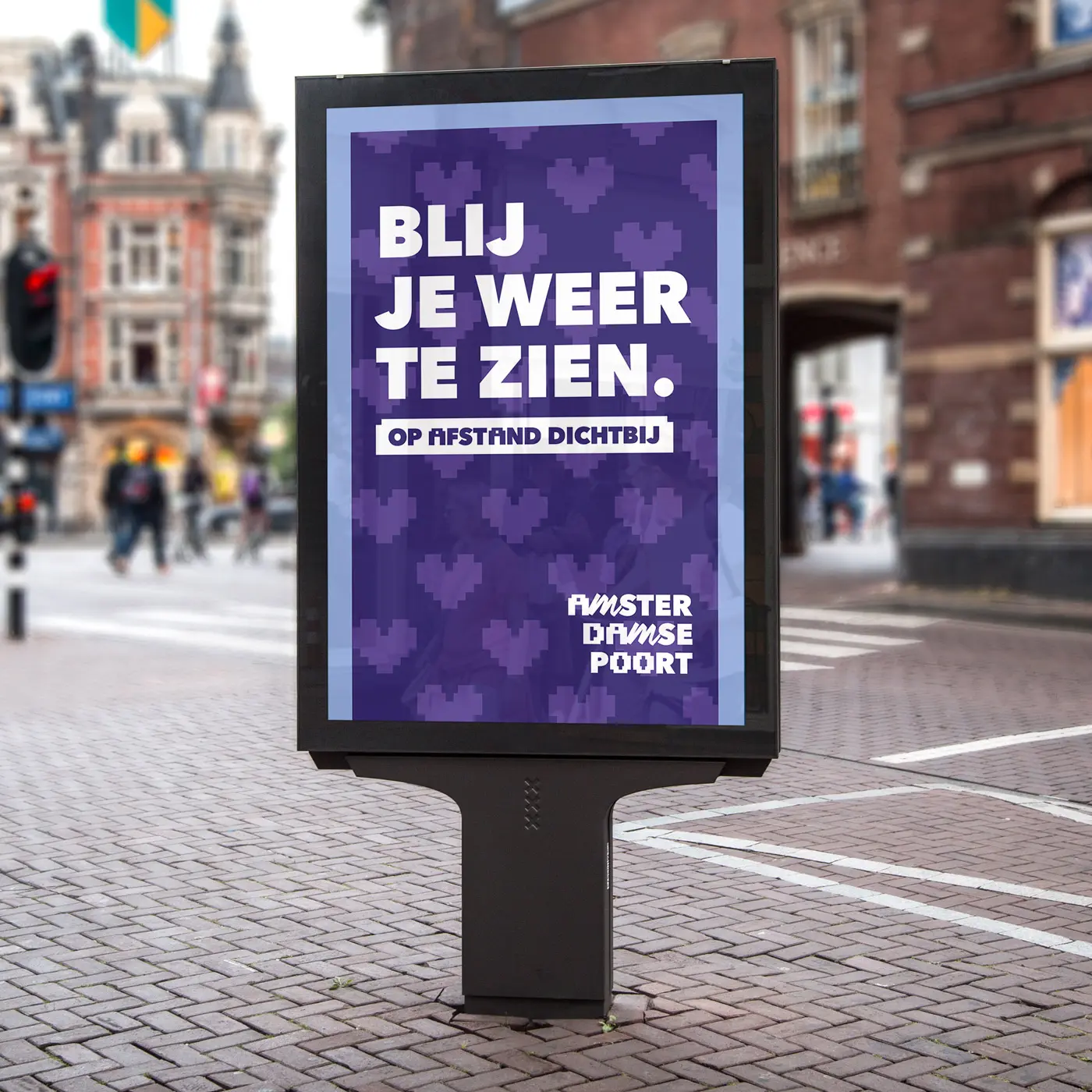
The visual identity does not have a logo, but it has a font that is unique to this area and is made up of different types of letterforms. The animation adds a vibrant layer to it and brings the identity to life. Portraits of the local community are a key part of the communication and are done by Coco Olakunle.

It's alive
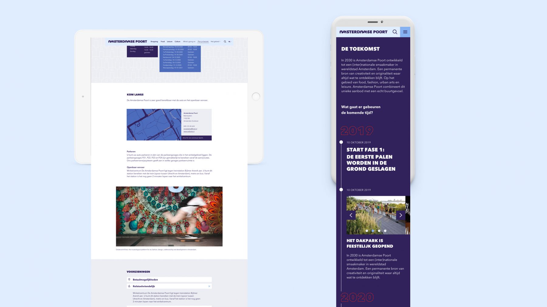
The identity comes alive in the neighborhood’s shopping district and online channels. A combination of social media and an up-to-date website showcase everything that’s happening in stores, cafes, restaurants, and event locations.